Categories
Blog Data Visualization

How Data Visualization Consultants Choose the Right Tools for a Project?

Ever delivered a data visualization that resulted in a series of misinterpretations or unmet client expectations? 

If you ever experienced something like this, you know how crucial the right tools are. 

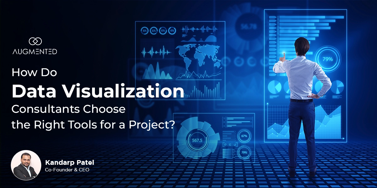
Choosing the right data visualization tools can enhance or hinder your data’s impact. But, data visualization consultants always hit the mark with the right tools. 

How do they do it? No. It’s not just luck but a strategic approach involving consideration of project needs and tool capabilities.

Do you find it challenging, too? Read the blog post to learn how visualization experts choose the best tools for each project.

8 Steps for a Successful Tool Visualization Selection

Wondering how data visualization consultants ensure that every visualization is precise and impactful? How do they always select the right tools and lead to clearer insights? 

Here are 8 steps that data consultants use to choose a visualization that adheres to data visualization best practices and ensures that their projects bring successful outcomes. 

Step 1: Identifying the Requirements

Imagine taking a U-turn to reach your destination when you were supposed to take a left. Selecting a tool without understanding your client’s project needs is not just a misstep; it’s a potential disaster waiting to happen. It will only lead you off course.

That’s why a data visualization developer or consultant understands the stakeholders and their needs before selecting a tool. They focus on questions like-

  • What does the client aim to create?
  • Who is their target audience?
  • What is the purpose of the visualization?
  • Should it be an interactive dashboard for real-time analytics?
  • Are static reports sufficient for the stakeholders?

Different tools have different features, each catering to different and unique project needs. For instance, you cannot use tools like Bar charts and Line Diagrams to create interactive dashboards. 

Step 2: Understanding Data Complexity

With multiple data visualization tools available in the market, you have the option to select one of the best data visualization tools for your project. 

But why would you invest in a tool when you have straightforward data? Of course, complex data sets need intricate tools. To understand the sole purpose of your visualization, you need to first understand how complex your data is.

  • Do you need sophisticated analysis? 
  • Will the data need customization?
  • How can it be represented effectively to communicate the right information?
  • Can your data be summarized to reduce its complexity?
  • Is there any duplication of the data?
  • Do you need specific features in the tool to filter key data?
  • Will your data need interactive data visualization techniques?

Therefore, consultants first break down and understand the complexity of the data. Once they achieve a clear insight, they visualize the information without overloading themselves with data. 

Step 3: Focusing on Insights

What is the ultimate goal of data visualization? Transforming data into actionable insights using visuals. These insights tell stories, reveal trends and drive the decision-making process.

Data visualization consultants prioritize tools that effectively communicate these insights. Why? Because these visualization insights

  • Influences decision-making,
  • Effective storytelling captures attention,
  • Fosters buy-in and 
  • Helps identify trends, patterns, and anomalies.

Moreover, they try to avoid overwhelming the stakeholders with raw data. Scalability is also essential for future-proofing the entire project. The project will grow, as will the needs, such as data volumes, user loads and additional features.

Data visualization developers or consultants, thus, focus on insights before selecting a tool. 

Step 4: Evaluating the Right Tools

Selecting a technically capable tool is not rocket science. But does the selected tool ensure to align with the project needs? The tool you select directly impacts the effectiveness and quality of your project. 

Data visualization consultants evaluate the tools and their features before choosing the one that fits their project. Evaluation can be based on the following questions.

  • Is the tool customizable and allows modifications to the code (e.g., D3.js)? 
  • Is the tool template-based, user-friendly and has an intuitive user interface?
  • Can it connect with the client’s existing datasets?
  • How smoothly can the tool integrate with third-party applications?
  • Is it scalable and how will it perform if yes?

Many other similar questions and tool features are considered by consultants before making an informed decision. 

Pro Tip: If you are still unsure which tool best suits your needs, contact us for the best data visualization consulting services today.

Step 5: Iterating and Gathering Feedback 

You don’t want your audience to be bored, right? Most visualizations may have the right information. They would be perfect for your scalable projects. 

But what if the high-stakes visualization you created bores your audience? What if the visuals or data you present mislead the client? 

Thus, to make visualization more engaging and accessible, data visualization developers strategically transform static visuals into meaningful stories. They do so by continuously gathering feedback from the audience. 

Furthermore, the visualization developers

  • Drill down details and uncover insights that interest the client. 
  • Make the user experience more immersive with interactive dashboards. 
  • Personalize insights to allow users to explore areas of their relevance. 
  • Understand how different variables affect the trends and patterns. 

Because every client and every project is unique. A sales executive would want to access the data based on the region he covers, while a finance manager would focus more on budgetary trends. 

Step 6: Ensuring Data Accuracy and Integrity

What is the use of investing in a sophisticated, user-friendly, and best data visualization tool if the result is misleading and incorrect?

The accuracy and integrity of your visualization will not only instil confidence and trust in your client but also create a solid base for decision-making and saving money.

For the same reason, consultants:

  • Validate data sources by verifying the credibility and reliability of your data source. For instance, how the data was collected? When was it last updated? How frequently is it updated?
  • Next, they identify and rectify errors, remove duplicate datasets, handle outlines and standardize the format by performing data cleaning.
  • Quality checks such as data validation rules, consistency and similar quality checks are conducted.
  • Furthermore, outdated data leads to inaccuracy and missed opportunities. Thus, data visualization consultants ensure that they stay updated with the latest changes and trends. 

Thus, data visualization developers validate their data, stay updated, and clean their data before selecting the best data visualization tools for their projects. 

Step 7: Considering Cost and Licensing

Say you are a startup and approach a data visualization consultant to develop dashboards for your marketing strategy. 

Now imagine the consultant suggesting you a tool that costs more than your planned budget. Moreover, it also requires you to pay a separate fee for licensing. 

Will it be feasible for you? No. Here’s why, when selecting a data visualization tool, consultants weigh the cost and licensing structure of the tool. This ensures that the tool fits the:

  • Client’s budget needs,
  • Provides required features and
  • Is scalable.

Finding the right balance between all these factors is crucial for selecting the right tool. 

For instance, tools like Apache Superset offer robust functions without licensing costs, making them ideal for clients with tighter budgets. Tableau would be a perfect fit for you if you do not have financial constraints. 

Step 8: Maintaining the Brand Identity

How would you react to looking at a presentation with every slide looking different? It would be distracting and leave you confused. Inconsistent designs in data visualization can be just as jarring. 

The data visualization consultants ensure that the designs are professional, reinforce the client’s identity and engage the stakeholders as well as the audience.

How do they do it? The answer is by maintaining the brand identity.

  • The brand’s colors, fonts, tone, and everything is considered to reflect the brand identity. 
  • The entire visualization follows the same style and is consistent throughout.
  • While brand identity is the key, the main focus remains clear in the overall visualization.

The data visualization developers create captivating and cohesive visual narratives that empower organizations to make informed decisions while maintaining their identity.

A good data visualization consultant will not only possess technical proficiency or provide tailored solutions but also demonstrate a knack for storytelling through data and an understanding of user experience principles. 

Top 3 Data Visualization Tools: A Side-Side Comparison

Data is growing at a rapid rate. Every day, a staggering 402.74 million terabytes of data are generated. Businesses are still struggling to understand this data, caught in a maze of manual data entities, spreadsheets, and siloed data. 

With numerous data visualization tools in the market, it isn’t easy to find the best one. But why settle for less? 

So, to help you make a better and quick decision, here is a side-by-side comparison of the top 3 data visualization tools of 2024.

Feature

Microsoft Power BI

Tableau

Qlik Sense

What?

Allows users to collaborate with data and track their goals.

Allows users to analyze their data and share insights. 

This data visualization tool uses artificial intelligence (AI) to help use data more effectively.

G2 Rating

4.5/5

4.4/5

4.5/5

Software Integrations

Yes

Yes

Yes

Real-time Analysis

Yes

Yes

Yes

Free Trial 

Yes

Yes 

Yes

Deployment

Cloud, On-premise

Cloud, On-premise

Cloud, On-premise

Starting Price

$10 / user/month

$15 / user/month

$30 / user/month

Ease of Use

User-friendly and integrates with Microsoft products like Excel and Azure.

User-friendly and requires expertise with advanced features.

Higher customization is available. Steeper learning curve.

Data Visualization

Plenty of options, visually attractive but not as customizable as Tableau.

Advanced features and highly customizable

Strong visualization. AI-driven insights.

Security

Integrated with Microsoft security protocols

Needs additional investments in security measures

Advanced government and security features

Integration

Integrates seamlessly with Microsoft (Excel, Azure)

Integrates with various platforms, esp for cloud-based data. 

Integrates with different data sources and focuses on real-time data. 

These are some of the most crucial factors that you may consider before selecting a data visualization tool. However, selecting the right tool depends solely on your project needs. 

Conclusion

Don’t let the wrong tools define your identity. Make data-driven decisions and turn your raw data into compelling stories with Augmented Systems. 

Our experts will choose the right tools and give your data the impact it deserves. Our data visualization consulting services will make your data look good and give your business the competitive edge it deserves. 

Contact us today to make data work for you.

Categories
Blog Data Visualization

Ten Myths About Data Visualization

Data visualization is an essential practice for communicating complex information, but there are many misconceptions that can lead to ineffective representation of data.

In a world flooded with information, the ability to transform raw data into meaningful and actionable insights is critical. Visuals help distill complex datasets into something more digestible and engaging, making it easier for people to grasp key trends and patterns.

However, with the growing popularity of data visualization, various myths have emerged, leading people to believe that creating effective visuals is either overly simple or unnecessarily complicated.

Below, we debunk ten common myths about data visualization and offer insights into creating better, more effective representations.

Myth 1: “There is a ‘best way’ to visualize any dataset – regardless of the audience or purpose.”

There’s no such thing as a universally “best” way to visualize a dataset. There are many potentially good ways, but the best one depends on the intended audience and the purpose of the dashboard.

To design meaningful representation of data, it’s crucial to understand who the audience is and why they need to see the data. The goal shouldn’t be to find the perfect visualization but to create one that best serves the purpose of the representation.

Myth 2: “It’s possible to create completely unbiased, objective charts that ‘just show the data.’”

Every representation of data is shaped by numerous design decisions, all of which influence how the audience perceives the data. A chart is always an interpretation of the data, reflecting the choices of the designer.

Some choices, such as selecting appropriate scales or focusing on certain variables, might not introduce harmful bias but instead reflect good practice. Bias can also be reduced significantly by sticking to standards in the field while acknowledging that some level of interpretation is inevitable. The goal is transparency and minimizing misleading representation.

Myth 3: “It’s impossible to prove that one representation of data is better than another – it’s all just opinion.”

In theory, different visual designs can be tested and evaluated experimentally to determine which is more effective. Mastering the practice of data visualization involves making educated decisions about how an audience will respond to various designs.

This is not just a matter of opinion—chart designs can be optimized based on how well they communicate the intended message.

Myth 4: “The best way to get people to pay attention to a visualization is with slick graphic design.”

Not necessarily. In fact, flashy designs often make visualizations harder to interpret and less useful. The most effective way to engage an audience is by avoiding common pitfalls, such as overly complex designs or unclear data representation.

The most engaging visualizations are often visually simple and require no artistic flair to create. They minimize cognitive effort and make the information clear.

However, it’s also worth noting that some degree of aesthetic design can help engage users or make charts more memorable. The key is balancing aesthetics with clarity.

Myth 5: “If it looks good, it must be good.”

The visual appeal of visualizations has little to do with its usefulness. While it’s possible for charts to be both visually impressive and effective, this is rare and difficult to achieve.

The primary role of data representation is to convey information, and good design should prioritize clarity over aesthetics.

Myth 6: “Graphic designers, data analysts, or expert software users must be good at creating useful representations.”

Graphic designers may excel at creating visually appealing graphics but often lack training in how to communicate data effectively.

Data analysts and scientists are skilled at analyzing data but may struggle with translating those findings into clear visualizations. Similarly, being proficient in software tools like Excel, Tableau, or Power BI doesn’t guarantee the creation of effective charts.

Creating useful visualizations requires a blend of software expertise, data literacy, domain knowledge, creativity, and an understanding of the audience’s needs.

Myth 7: “The visualizations shown in data visualization software vendors’ marketing and training materials must be good, right?”

Not necessarily. Marketing materials from software vendors often include poor practices and ineffective visualizations. Take these materials with a grain of salt—what’s shown as an example of a tool’s capabilities isn’t always a model for best practices.

Myth 8: “Not knowing much about data visualization just makes you a beginner.”

Inadequate knowledge of data visualization doesn’t just label someone a beginner—it can lead to charts that result in poor decisions. These charts may misrepresent reality, fail to highlight key insights, or simply not be read because they require too much effort to interpret.

Myth 9: “Chart type selection is based entirely on the nature of the data.”

While the nature of the data (e.g., time series, categorical data, etc.) is an important factor in the selection of visual, it’s not the only one. The purpose of representation, the types of comparisons to be made, the patterns to highlight, and the audience’s ability to interpret graphs are all critical considerations.

The selection of visualization is a balance between the data’s characteristics and the specific goals of the visualization.

Myth 10: “If the data is complex, the representation must also be complex.”

It’s a common misconception that complex data requires equally complex visualizations. The opposite is often true. The goal of data visualization is to simplify and clarify complex information, not to overwhelm the audience with intricate designs. A clear, straightforward representation can often make even the most complicated data easy to understand.

Key Takeaways

When creating visualization, the goal should be to make them useful and aligned with their intended purpose. There is no single “best way” to visualize data for every audience; instead, design choices should be made with the chart’s purpose and audience in mind.

While no chart is entirely free of bias, transparency, and good practices can significantly reduce harmful distortions.

The nature of the data is crucial in visual selection, but audience and purpose fine-tune the design rather than entirely dictate it.

Many design decisions, including the selection of visuals, are influenced not just by the data itself but also by the chart’s specific goals and the needs of the audience.

Slick design isn’t inherently bad; it’s about balancing appeal with clarity and function.

Finally, being a graphic designer, data analyst, or software expert does not automatically make someone skilled at creating effective data visualizations.

Categories
Blog Data Visualization

10 Best Practices for Data Visualization: Turning Data into Insight

Have a map to hunt your treasure but not sure how to read it? Poor data visualization can make you feel the same way —clueless! You have the numbers but zero insights into your data. 

Data can be a mess, but it’s the shortcomings of your design that make it meaningless. Data visualization is about leaving an impact—one that is so effective that people understand it at first glance. 

So, if you don’t want to miss the mark with your data visualization, we have hand-picked the top 10 best practices for data visualization

Ready to create visualizations that leave an impression? Let’s get started. 

What is Data Visualization Software?

Data is universal and growing rapidly. Data’s true meaning lies in how you present it to the world. People are drawn to beauty, and data visualization is important for making your data beautiful.

But the real question is, how do you make your data appealing to your audience?

What is Data Visualization?

Data visualization is an effective way to transform data into visuals. Visualizing your data makes complex data easier to understand. Moreover, it assists in making crucial business decisions by analyzing trends and giving meaningful insights.

And how do you do that? By leveraging the right tools and following the best practices.

What is Data Visualization Software?

Data visualization software is a tool for creating stories to provide meaningful insights with data. It can help you present sales figures to your teams, analyze trends in your project or make data-driven decisions for your business.

There are several tools available in the market that can help you in creating visualizations. Using these tools, you can easily present the big picture of your data to your audience. The most common visualization tools include:

  • Tableau
  • Power BI
  • Google Data Studio
  • QlikView
  • D3.js (Apart from many others)

From monitoring everyday operations and mitigating risks to simply finding new ways to grow your business, data visualization is one of the best ways to give meaning to your data. 

If you are unsure about utilizing these tools, you can either hire data visualization specialists or follow the latest trends in data visualization

When and Why to Use Data Visualization?

Data visualization, as easy as it may seem, is not a cup of tea for everyone. You cannot simply put your data into charts and graphs to present it. You must know when, why and how to present your data so that it’s not misleading.

Why Data Visualization?

So, let’s first talk about the amount of data generated each year. Or perhaps each day? 

Approximately 402.74 million terabytes of data are generated daily. Shocking? No! As the technological world grows, the data is also growing exponentially. By 2025, it is projected to grow over 180 zettabytes. 

Now imagine comprehending all this data! It is indeed difficult, time-consuming and stressful. So, to manage all this data, you need data visualization.

When is Data Visualization Useful?

Whether you are a business owner, a scientist, or a financial analyst, large and complex datasets are difficult to understand. From saving time to monitoring KPIs (Key Performance Indicators), data visualization is your go-to tool. 

Thus, it is worth spending on data visualization tools to understand the worth of your data. So start with knowing your data and understanding the elements of data visualization.

But for now, we have 10 best data visualization practices to help you make the most of your data.

Top 10 Data Visualization Practices 

Numbers + Visuals + Story = Data Visualization. Mere ‘Data’ is a cluster of numbers. Aesthetic visuals without visualization are just drawings. A story without visuals and numbers is a fairytale.

Data visualization is simply lines, curves and tables without displaying your data well or knowing where to start. Poor visualization is a big no! 

So, here are 10 best practices for data visualization, which can help you create useful, aesthetically pleasing visualizations that can be stepping stones for your business growth.

1. Defining a Purpose

Figuring out what your data means is one thing, but spending endless hours creating unnecessary visuals is like throwing yourself under the bus. Your visualization should be strategic. It should define a purpose and provide real value to your data. 

Ask these questions if you are unsure about defining the objective for your visualization.

  • What insights do you aim to achieve?
  • Who is your audience?
  • What key questions are you addressing?
  • What data do you want to visualize and how?
  • What trends and patterns do you want to highlight?
  • How will you measure the success of your visualization?
  • What data level is easy to comprehend for your audience?
  • How will it benefit you, your audience and your organization?

At the onset of you starting your visualization journey, take the time to cleary define your goals and priorities of your visualization. Think about the result and how it will impact the entire process.

2. Understanding the Audience

The cornerstone of effective data visualization is knowing your audience and grasping their requirements. Every detail counts, from knowing your audience’s needs to choosing their color scheme. 

Moreover, visualizations also depend on the type of audience you are presenting your data to. Is it the executives of a company, a sales team or the general public? You can ask yourself the following questions to execute the most insightful visualization.

  • Who you are trying to reach?
  • What is the data literacy of your stakeholders?
  • What information does your audience need?
  • What kind of decision does the user want to make?
  • What background context do they need?

Understand your audience before you begin the process and tailor your visualizations based on their needs. The more detailed your answers are, the better you understand your audience and create intuitive visualizations.

3. Selecting the Right Visualization

Data is no longer crucial only for data professionals. It serves as the key element of all decisions. 

Thus, your choice of visualization can affect how your audience receives your data. So, to avoid confusing or misguiding your audience with the wrong visualizations, ask yourself the following questions.

  • What is the type of data you are working with?
  • Which visualization highlights the data’s key points?
  • How can you simplify your complex data for clarity?
  • What trends or insights do you need to emphasize?
  • What type of relationship do you want to present?
  • What tools or techniques will support your visualization needs?

Data helps you make all your daily operational decisions essential to your business transformations. So, ensure that you select the right visualizations for your data.

4. Simplifying the Data

Your data grows as your organization grows. Data becomes increasingly complex with time, and understanding complex datasets is like searching for a needle in a haystack.

By using multiple layers or charts, you can present intricate information in a way that empowers your audience to grasp everything. If you’re unsure how to simplify your complex datasets, consider the following questions. 

  • How can you summarize the data to reduce complexity?
  • What data is unnecessary or duplicated?
  • How can you convert the data into simpler chunks?
  • What filters can you use to focus on key data?

Thus, break down your complex datasets into manageable and digestible segments. This will allow you to visualize the information better without overloading it. 

5. Choosing Relevant Data Points

Your content needs to be snackable. Complex visualization leads to the creation of distracting dashboards. So, include only the most relevant data points. The data points should:

  • Support the narrative
  • Temp the audience and 
  • Save time.

Here is an example of complex vs. simple visualization. 

Do not overload your audience with all the information with unnecessary data points. Plan your visualizations and then present them to the relevant audience.

6. Keeping it Simple

Look at the chart below. It is confusing and not easy to comprehend. The chart communicates the data but overwhelms readers, who cannot make quick decisions or gain insights. Hence, keep your visualizations simple. 

If you feel every data point is crucial, ask the following questions to make it simple, unique, and presentable. 

  • What are the most important data points?
  • How can you summarize the data to make it less complex?
  • What unnecessary details can you exclude?
  • What visual aids can you use to make it more understandable? 
  • How can you break big datasets?
  • Can you group similar datasets?

Less is always more, so understand the needs of your end users. If your charts are complex, educate your audience about the available data points. 

7. Making it Interactive

Today’s users expect interactions. They do not just want pretty visuals; they expect to engage with your data. Interactive visualizations are important, whether your visualization is about tracking fitness progress or providing a weather forecast.

So, how do you make interactive visualizations? Below are a few points to help you make the most appropriate visualization.

  • Select the right tools and techniques.
  • Look for software that offers a range of features.
  • Structure, clean and prepare your data
  • Select the type of visualization that fits your design and data needs
  • Add interactive elements, such as filters and tooltips 

Interactive visualization suits the user’s needs, boosts engagement and overall productivity, and helps simplify complex data. 

8. Telling a Story

What is the unique value of using data to tell a story? Data storytelling transcends mere numbers when it comes to engaging your audience. It’s the key to unveiling the underlying narrative that informs and persuades your audience.

The benefits of telling a story with your data are many, some of them include:

  • Helps make informed decisions based on your data
  • Gives access to relevant data at the right time
  • You can make data-driven decisions.
  • Prevents confusion

So, be clear about who your data story is for. The story should align with the frequency of your decision-making. Moreover, the data must align the themes with the colors, fonts and logo to meet your business’s guidelines. 

9. Customizing for Personalized Experience

Imagine a store with products tailored only to your needs and preferences. Wouldn’t you connect more with the store? Similarly, the audience connects more with personalized visuals. So make your visualizations that interest your audience and their requirements.

To understand your audience, ask yourself the following questions:

  • Who are the users, and what are their preferences?
  • What color palettes and themes resonated with your audience?
  • What interests your users, and how can you incorporate that into your designs?
  • What interactive features will benefit your audience?
  • How can you provide easy access to top data?

Therefore, make the most creative and appealing visuals customized for a personalized experience.

10. Ensuring Accuracy and Integrity

Maintaining data accuracy and integrity is vital in data visualization. So double-check your source, clean your data, and verify your visuals for accurate reports.

To accurately represent your data, here are some questions that can help you.

  • How will you verify the accuracy of your data source?
  • What steps will you take to clean and pre-process your data?
  • How will you handle missing or incomplete data?
  • What methods will you use to validate data accuracy?
  • What quality measures will you take to detect errors and correct them?

Addressing these questions, you can enhance the accuracy and integrity of your data visualizations. 

Conclusion

Want to create impactful visualizations and stay ahead of the curve? Then, focus on visualizations that aren’t just fancy but also give meaning to your data with the designs.

Not sure where to start? Let Augmented Systems’s data visualization specialists help you, similar to the countless businesses we helped transform. To drive growth and success, contact us today.

Categories
Blog Data Visualization

The Role of Data Visualization Consultants in Driving Decision-Making

Despite powerful visualization tools, many still struggle to utilize the complete potential of their data. 

If you feel the same way, consider hiring data visualization consultants. These experts help turn your unstructured data into compelling stories.

Want to know how? Dig into the blog to learn how data visualization consultants can help you drive decision-making with your data. 

What Does a Data Visualization Consultant Do? Who are They?

Data visualization consultants design and develop data visualizations and dashboards for businesses and firms. 

  • They translate data into visual information using graphs and charts. 
  • The information then becomes accessible to everyone and easy to understand.
  • They create user-friendly dashboards using data visualization tools like PowerBI, Tableau, and Infogram. 
  • Moreover, they are experts in storytelling using business intelligence tools with your data.

What are the Tasks of Data Visualization Consultants?

Consider data visualization consultants as translators who convert raw data into appealing visualizations. They offer expertise, advice, and insights for your data.

A few specific tasks that data visualization consultants do:

  • Access data processes and recommend best practices
  • Manage and implement data solutions
  • Educate team members on the data visualization process
  • Train employees in data management and analysis
  • Help identify potential risks, problems and opportunities
  • Create data models
  • Generate reports and dashboards
  • Develop data security protocols
  • Help businesses recognize their most valuable data assets
  • Provide technical support

Data visualization specialists have the complete expertise to understand your data inside out. 

Why are Data Visualization Consultants Required?

You may have the best visualization tool or know the most favorable data visualization technique for communicating complex information, revealing patterns and telling stories. But, creating visually compelling visualizations can be difficult. 

Therefore, you might need data visualization specialists for many reasons. Here are the three most common reasons:

  • They can help you understand the big picture of your company data.
  • Consultants help with decision-making analytics.
  • It is handy for them to identify trends in your raw data.

Data visualization consultants help you bring that value to your visuals with their expertise and knowledge. Let’s look at how these consultants can reveal the hidden value of your data. 

5 Benefits of Hiring Data Visualization Consultants

Data visualization consultants can be the most valuable asset for your business. Not only do they streamline your data, but they also recommend the best tools. They handle repetitive tasks and other time-consuming data activities. 

Hiring a data visualization expert has many benefits. Let’s summarize the big ones and see how to leverage their expertise for your business. 

1. Enhanced Data Interpretation

Data visualization consultants bridge the gap between unorganized data into meaningful insights. By simplifying complicated data assets, they turn the unprocessed data into easy-to-understand representations. 

  • Aesthetically pleasing data visualizations are easy for everyone to understand, regardless of their technical knowledge.
  • Experts uncover trends, relationships and anomalies.
  • They help craft stories with your data that make data more engaging.

Data visualization consultants focus on what truly matters and deliver a picture.

2. Better Decision Making

A thorough understanding of the data is crucial. Data visualization consultants have the expertise to comprehend the data to unlock its core potential. 

  • They have the clarity and insights into the data that help make data-driven decisions.
  • Not all charts are the same. Experts know to select the most appropriate visualization types for your data.
  • They ensure that the information is presented accurately and delivers the intended message.

Data visualization specialists use sophisticated visualization techniques to foster quick decision-making and lead to enhanced business outcomes. 

3. Reduced Risks

Data visualization consultants help businesses identify hidden risks, such as sales dips or security gaps. They do this by identifying hidden trends that would otherwise be missed. These patterns expose potential risks.

  • The potential pitfalls identified by experts help mitigate risks.
  • Businesses also become aware of emerging competitors or a shift in customer requirements. 
  • With sharp data insights, businesses get the privilege to make better choices. 
  • For example, an expert can make a dashboard that tracks KPIs (Key Performance Indicators) related to cyber security attacks. 

Thus, you can monitor risks and take steps to mitigate them with the help of a consultant.

4. Increased ROI

Consultants help businesses make informed decisions that lead to optimal resource allocation. Improved business outcomes eventually maximize the return on investment (ROI.)

  • Businesses can facilitate operations, downsize costs and boost productivity as consultants help find bottlenecks.
  • They help boost sales and customer trust by understanding the market trends and customer behaviors.
  • Experts visualize data that reveals profitable areas of your business. 

Data visualization specialists have expertise in making data more accessible, actionable, and operational. By leveraging their knowledge, businesses can gain tangible business value.

5. Tailored Solutions

Data visualization consultants understand your business and data. They bring clarity according to your specific business goals and challenges. 

  • With numerous visualization tools available, such as Tableau and Power BI, experts help you find the one that best fits your data and budget. 
  • By keeping future data growth in mind, they create visualizations that can integrate with your system.
  • Experts understand the importance of the target audience. They create visuals that are easy to understand by the target audience.

Thus, the experts provide tailored solutions for impactful data visualization and create visuals that meet your unique requirements.

Top 10 Questions Before Hiring a Data Visualization Specialist

Of course, data visualization consultants are experts in their field. But how do you know if they are well-versed in your business? 

So, before hiring an expert, ask these top 10 questions. 

  1. Can the consultant walk you through the process of understanding a business? 
  2. How does the consultant translate a client’s business goals into data visualization strategies?
  3. Does the expert have a project example that showcases the skills and knowledge?
  4. What data visualization tools is the consultant proficient in?
  5. What is the process of selecting a tool for a specific business?
  6. How does the consultant perform data cleaning and transformation before creating visuals? 
  7. What is the consultant’s way of communicating with an organization’s necessary teams or members?
  8. Does the consultant provide tailored solutions?
  9. Is there transparency when it comes to both technical and non-technical decision-making?
  10. How does the consultant ensure the security and privacy of data during the entire process?

These intuitive questions can help you assess the consultant’s approach, expertise and communication style. 

Conclusion

Hiring a data visualization consultant brings many benefits to your business. The experts partner with you and understand your data. They ensure that you make smarter choices with your data. 

If you want clarity with your data, our experienced consultants at Augmented are here to help. Feel free to contact us today.

Categories
Blog Data Visualization

What is the Difference Between the Data Analytics and Visualization?

Numbers and data everywhere, but struggling to make sense of them? Does jargon like data analytics and visualization make it tricky to understand?

We all have been there. The struggle to understand data and trying to figure it out is a common battle. Almost everyone has been flooded with reports and flashy charts. On top of that, terms like data analytics and data visualization make it more tough.

But don’t let data make you feel lost. This blog is here to help you determine the difference between the two terms and how to use them.

So, let’s get started.

What is Data Visualization?

Data visualization is organizing complex data sets into a simple and clear format. Charts, graphs, maps, and other visual designs simplify intricate data, numbers or information.

Imagine walking into an office and seeing messy sales figures on the whiteboard. Looking at the numbers, you may wonder whether they are important or just collecting dust.

Data visualization uses charts and graphs to help clear these jumbled sales figures, giving you a clear picture of the hidden data, patterns, and trends.

Example:

You are the marketing manager for a manufacturing company. You are managing intricate production processes, mountains of data, complex machine decisions and customer demands.

Constant monitoring and a constant stream of this data can be a headache. Here is when you can leverage the key components of data visualization and transform your scattered data into actionable insights.

Data visuals like scatter plots or charts can help you break down and compare elements like performance metrics or customer demographics.

What is Data Analysis?

Data analysis is a process of examining and understanding data. Once analyzed, you convert and organize this data to understand trends or patterns and make informed business decisions.

In simple terms, data is like a box of LEGOs. It has several pieces, but they make no sense until stacked together to build something. Data analysis helps convert the scattered, “not so meaningful” data into something meaningful.

Data analysis uses tools and techniques to uncover data patterns or trends. Moreover, with the ever-changing dynamics of data, data analysis trends are also evolving with time.

Example:

Apart from many other factors, the secret to running a manufacturing company is efficiency. However, the ever-evolving and disintegrated data makes it challenging. You need to know how to optimize and convert it into a profitable one.

When you analyze data, you can identify bottlenecks, optimize processes, and predict market trends. This can be done for different areas of your business, such as production processes and inventory management.

The Difference: Data Visualization Vs. Data Analytics

Data analysis and visualization go hand in hand but are not the same.

Data analysis uses statistical tools and techniques to find the hidden patterns and trends in your data. Data visualization uses those insights to transform your data into easy-to-understand visuals.

Here is a side-by-side comparison for both to help you better understand.

Factors

Data Visualization

Data Analysis

Uses:

Data visualization converts the analyzed data using graphs, charts and other visual tools, into clear and compelling information. The represented information becomes easy and simple to understand or remember. 

Data analysis helps extract meaning from your data. You can simplify your complex data with data analysis. Data analysis finds conclusions about your raw data or information, making it more manageable and comprehensible. 

Benefits:

Data visualizations help business owners make quick decisions. You can comprehend the given data even at a glance. 

Helps provide a foundation for data visualization, apart from identifying masked data trends. 

Limitations:

It can be difficult to handle very large sets of data. If presented using a wrong visual tool, it can lead to many wrong business decisions.

It is time-consuming and requires skills to understand the data.

Purpose: 

The purpose is to simplify and clarify the questions of “why and what” using visual tools. 

To find answers to the “why and what” behind your data. What and why is it happening? What is the purpose? What could be the outcomes?

Tools / Platforms:

Tableau, PowerBI, Zoho Analytics.

Google Analytics, SAS, Python.

Techniques:

Static data visualization and Interactive data visualization.

Descriptive data analytics, Prescription data analytics and Predictive analytics. 

Types:

Graphs, charts, plots, maps, diagrams, histograms and more.

Descriptive statistics, Data mining, Machine learning algorithms, Time series analysis and more.

Industries:

Data visualization applications are used by various industries, including healthcare, finance, manufacturing industries and more.

Industries including government, retail and travel agencies. 

Co-dependency:

Data visualization relies on the identified and pattered data presented by data analysts. 

Data analysis won’t be able to give meaning to the analyzed data without data visualization.

Used By:

Covers a broader audience, including organizations, business owners,  data visualization consultants, and the general public.

It targets data decision-makers, analysts, engineers, and scientists who can understand the technicalities behind the data.

Data analytics and visualization may seem like synonyms in general terms but differ in the wider data community. However, they complement each other, with one (data analysis) delivering insights and the other (data visualization) presenting those insights to a wider audience.

How Do Data Analysis and Visualization Work Together?

Data analysis and visualization are like the two sides of a coin. They are co-dependent—data analysis helps understand the massive data, while data visualization converts it into pictures to make it easier to understand.

Data analysts, with their expertise, play a crucial role in making informed and effective business decisions. They extract meaningful information from structured and unstructured data, providing you with the confidence to make the right choices.

Endless columns and rows of a gigantic spreadsheet make data overwhelming. Data visualization tools are used to draw actionable conclusions and make the data interactive.

Conclusion

Imagine analyzing sales data and finding an underperforming section. You know the value of this information for your business but are unsure what to do with it to grow better.

Now, use visualization tools to compare the underforming information with other aspects. The result: a clear picture of concerns that are now easy to brainstorm to bring solutions. 

Grasping data analytics and visualization is crucial, no matter your field. So stop doing the guesswork and make smarter decisions based on evidence. 

And if you are unsure how or where to start, Augmented Systems is here for you.

Categories
Blog Data Visualization

How Do You Plan for a Data Visualization Process?

From spreadsheets to the real world, data visualization translates boring information into insightful visuals.

However, no matter how appealing it would seem, creating a visual report is like presenting a news story. It should be attention-grabbing, communicative and engaging.

You cannot just add pretty pictures to your charts and graphs. Data visualization aims to convert complicated information into useful, understandable data. To do so, data visualization planning should be your first step.

So, before those numbers overwhelm you and your audience, learn how to plan your data visualization projects with this blog. 

Let’s dig in. 

Understanding Data Visualization Planning

Data visualization is not a child’s play. It needs careful planning and execution. So, you need a data visualization plan:

A. To tell a compelling story through your data and

B. To make your data accessible to a wider audience

It is rightly said by Yogi Berra – “If you don’t know where you are going, you’ll end up someplace else.” From daily chores to running a billion-dollar business, planning is important and can never be neglected.

Let’s say you are the marketing head of a huge organization and are about to launch a new project.

Will you directly delve into launching the project without any planning? Of course not! You will create a solid plan and define your objections, such as discussing product awareness and conducting proper research.

In the same way, planning is one of the key factors of data visualization projects. Thus, we have summarized the planning process in six simple steps to help you create meaningful visuals that narrate a story through your visual presentations. 

Let’s dive in.

6 Steps to Plan an Interactive Data Visualization Project

Quick tools and various data visualization software are available on the market to help you prepare your visualization projects. The tools will visualize your data in a cookie-cutter fashion. 

But will your data connect with your target audience? Will it create significant visuals? Will it analyze the data before visualizing it? It may or may not. 

So, plan your visualization process with these six steps to prepare interactive data visualization projects.

Step 1: Define Your Question

Wrapping data into colors and pretty aesthetics is one of the pitfalls most fall into during data visualization. 

But the first step is to determine what to do with your data. Your data will not make meaning unless you know what to do with it. Therefore, before you start visualizing it, clarify why you are visualizing it.

Ask yourself questions:

  • What are the problems you are facing?
  • What is the issue you want to solve?
  • What is the message you wish to communicate?
  • How will visualization help you achieve your goal?
  • Will visualization give you answers to your questions?

By answering these questions and having them clearly defined, you will be able to move ahead. For example, a defining question would look like this: In which quarter of the financial year will you launch a new product?

Step 2: Find Your Target Audience

Imagine presenting a management-level visualization project to interns at your workplace. The interns would be baffled by the amount of data presented. 

Therefore, the second step is to understand your target audience. You can begin with a series of questions to get to know your consumers. 

  • Who is the audience?
  • What are they expecting?
  • What does your audience already know?
  • What is their level of expertise on a particular topic?
  • What do you want your audience to learn or visualize?
  • How do you want the audience to interact with your data?

Knowing your target audience and their needs is vital for any successful business. Understanding their knowledge and expertise level is also paramount. 

Your audience will influence your data visualization project and affect the choice of data formats, tools, and practices you select.

Step 3: Understand Your Data and Create a Story

Once you have defined your question and found your audience, the next step is understanding your data and building a story. 

The best way to do so is to ask your questions:

  • What are you trying to show or display with your data?
  • Is there a message you want to communicate using the data?
  • What are the variables in the data that you want to show?
  • Is there a relationship between the variables?
  • Is there a trend, pattern or relationship in your data sets?

Once you have the answers, create a story. You can determine if you want to compare your data or wish to project it based on changes over time. 

For example, you can create comparison stories with bar graphs, time-based stories with line graphs and categorial stories using tree charts. 

Step 4: Time to Select the Right Visual Tool

Step four is data visualization and analysis. Now, you need to answer how you intend to show your data to your targeted audience. 

Find out which tool appropriately suits your data’s visualization. Depending on the data you are trying to communicate, you can represent your data using various visualization software and tools. 

For example, there are charts, graphs, maps and plots. Also, consider your visual elements’ layout, color, shape, size, scale, and labels, as well as how they will interact with one another.

Step 5: Use the Graphics to Create a Purpose

Now is the time to finalize your visualization project by garnishing it with all the aesthetics. 

In this step, you refine your design to make it clear, effective, and engaging. 

You use data visualization rules and principles to make your data readable, aesthetically pleasing, and functional. 

For example,

  1. You can play with colors. Avoid red, as people often associate it with negativity. Moreover, no one wants to see sales “in the red.”
  2. You can add callouts, emphasize certain data sets, or provide important context. For example, if you did not include the data for a particular sales week, your audience might feel you missed it, but you can hide it by using a callout to prevent confusion. 
  3. Add a correct title to your data visualization project. Use the correct units (such as dollar signs, capacity, quantity, and even time vs. quantity).
  4. Also use a legend to explain the color schemes in your project. 

This way you ensure that the audience has no questions about what they’re viewing.

Step 6: Review and Share

The last but most important step is to review and share your data visualization project. 

Ask for feedback and reviews from people around you. You may also want to review your work differently, so let a nonexpert review your project. 

Once it is reviewed, share it with your target audience.

Conclusion

Creating a visualization that fails to communicate your data accurately is a big risk. Starting on the right foot is crucial, as a poorly prepared visualization can lead to skewed data. 

Therefore, by considering the steps mentioned above, you will be able to produce the most interactive data visualization project. 

Moreover, at Augmented, we have data visualization consultants and experts to help you with all your data visualization needs. Feel free to contact our team to handle any project, big or small.

Categories
Blog Data Visualization

The Future of Interactive Data Visualization: Emerging Technologies and Trends

Data visualization evolves rapidly as we stand on the cusp of more modern and overflowing data.

The importance of static charts and graphs still offers meaningful insights. However, they fail to capture the dynamic nature of data. 

Thus, a growing need for more interactive data visualization tools and techniques emerges.

Businesses and individuals also need to stay along to adapt to this technological march ahead.

So, let’s delve into the blog to see future interactive data visualization trends and techniques.

From Graphs to Virtual Reality: The Evolution of Data Visualization

Data visualization is a robust tool for businesses and organizations. It not only organizes the data but also conveys information effectively. 

Diagrams, maps, charts, and other traditional data visualization techniques have long been the mainstays of data visualization. However, these traditional techniques need to evolve with technological advancements.

Why? Let’s have a look.

The Boundaries of Traditional Data Visualization

Data visualization was a long and tedious process a few years ago. The tools and techniques have been changing with the growing data.


While traditional tools and techniques have been effective, they have limitations. These include:

  • Limited interactivity,
  • Difficulty interacting with complex data,
  • Inability to handle big data, and more.

To understand the limitations better, picture a scenario where a company uses charts/ graphs to analyze its sales performance. While the data visualization technique would be informative, the employees could overlook the hidden insights within the data.

On the other hand, an interactive data visualization tool or technique could change the entire scenario. How?

Let’s say the company uses a dynamic interactive visualization tool to analyze the same sales performance. Using this tool, the employees could get into the depth of data, such as 

  1. Identifying hidden trends,
  2. Comprehending specific timelines and
  3. Predicting future performance

Here comes the need for interactive data visualization tools and techniques.

What is Interactive Data Visualization?

Interactive data visualization lets you interact with data in real time, as seen in the above example. With interactive features and user-friendly interfaces, you can easily analyze complex data. 

Moreover, it provides a more immersive and personalized experience to the users.

Interactive data visualization tools, such as StatPlanet Cloud, GoodData, and Zoho Analytics transform spreadsheets and databases into interactive dashboards.

Traditional al VS Interactive Data Visualization

To understand how traditional data visualization has grown, let’s look at the difference between traditional and interactive data visualization.

Aspect

Traditional Data Visualization

Interactive Data Visualization

Interactivity

Offers limited interactivity to the users.

The engaging user interface offers better interactivity.

Collaboration

Limited collaborative interface.

Collaborative features, such as real-time data sharing.

Predictions

Limited or no future predictions do not allow users to explore beyond pre-defined parameters.

Helps predict future performances and encourages exploration.

Story-telling capabilities

Challenging to convey a compelling story using data visualization only.

Creates engaging narratives with the data.

Decision making

Lacks real-time insights.

Through interactive features, it offers real-time insights.

Example

A line graph showing temperature trends over time.

ChartGPT uses AI to generate data visualization using users’ text descriptions.

Tools 

Traditional data visualization tools such as Tableau, Google Charts, and PowerBI.

Interactive data visualization tools such as ChartGPT, GoodData, and Flourish.

These are a few differences between traditional and interactive data visualization. With the ever-growing nature of data, these differences are prone to evolve.

Top 5 Data Visualization Trends and Technologies in 2024

With emerging technologies and gazillions of data in the market, the urgency to adapt to the latest trends in data visualization is crucial.

Interactive data visualization stands at the forefront of this endeavor, as its future holds tremendous promise in shaping your interactions with your data.  

So, are you excited to see what the future holds for these emerging technologies?

Let’s have a look at what the future holds for these emerging data visualization technologies.

1. Artificial Intelligence and Machine Learning

Do you know that Machine Learning (ML) and Artificial intelligence (AI) are transforming the topography of data visualization? 

How? By automating processes such as pattern recognition, insight generation, and data analysis. 

AI algorithms can identify hidden data patterns and relationships in complicated datasets. ML (machine learning) models can help foretell future trends and behaviors. 

For instance, machine learning algorithms can analyze sales data sets to predict future trends. You can make data-driven decisions by leveraging these predictions. Moreover, tasks such as inventory management and resource allocations become easier. 

2. Augmented Reality and Virtual Reality

Virtual and Augmented Reality provides immense potential in the domain of data visualization. You can now display and understand complex data structures in a way impossible before.

Using these technologies you can create immersive and engaging visualizations that can help you better understand complex data sets.

To interact with your data, imagine how fascinating using a virtual reality (VR) headset would be. The headset would portray all the relevant information in virtual reality, making it engaging and captivating.

Users can also navigate through information landscapes to explore market trends or get into the depth of scientific data.

For example, you can change the real estate market by combining AR and VR. You can transform property data and market trends into 3D interactive experiences for your buyers. 

3. Storytelling with Data

Data visualization is evolving in numerous ways. From creating charts and graphs, it is now more about crafting narratives.

The future of interactive data visualization lies in its ability to engage audiences. Here is when the narrative of storytelling becomes a powerful tool. You can create narratives around data to captivate your audience and convey insights.

For example, you can present your sales journey growth using storytelling. Interactive visuals and crafting a story around your data can help you connect with your audience. Your audience’s connection will make complex information relatable and memorable. 

4. Real-time Visualization

Real-time visualization is a game changer when it comes to constantly growing data. You can monitor recent trends, identify anomalies, and make timely decisions with real-time visualizations.

You can also track changes, identify patterns, and respond to emerging trends in real-time. Real-time visualization is like seeing data as it happens.

For example, monitoring website traffic at any given point. You can react promptly, address potential issues or anomalies, and make informed decisions.

5. Mobile Friendly Data Visualization

With the ever-growing technological advancements, data visualization must adapt to smartphones. 

Mobile phones provide insights on the go. So, you can access your data in real-time with mobile-friendly visualization. It allows users to access readable data on their smartphones using interactive dashboards.

For example, you can make informed and real-time decisions if sales metrics are displayed on your mobile screen in an optimized format.

Conclusion

The future of data visualization is compelling and optimistic. Traditional visualization methods often need help to capture modern data, hindering your company’s growth. 

Embracing these trends and innovations is essential and not just an opportunity for businesses and organizations. So, stay up-to-date with these trends and innovations with us at Augmented Systems.

Only you can shape how you interact with your data and make informed choices in this data-driven world.

Categories
Blog Data Visualization

What are the Best Data Visualization Components for Compelling Stories?

Every business today is trying to leverage the potential of data-driven decision-making.

And it’s easy to see why…data can fuel:

  • Tracking customer behavior and preferences
  • Identifying business opportunities and risks
  • Measuring sales performance and revenue trends
  • Optimizing operations and efficiencies
  • Enhancing marketing campaigns with real-time insights

And so much more!

But here’s the catch: Raw data isn’t alone enough. Without the right tools to visualize it, all your valuable data and its information remain hidden in spreadsheets and reports.

That’s where data visualization components come in!

The right charts, graphs, and interactive dashboards help you transform your complex data into clear and compelling stories. (Helping you and your team to make smarter decisions, faster.)

But with so many visualization options available, how do you know which components are important for crafting your powerful data story?

To help you out, I’ve rounded up the best data visualization components that will bring insights to your data.

(Remember, there is a visualization solution for every data need!)

Let’s jump in! 

Data Visualization Components: Table of Contents

  • What does Data Visualization Mean, and Why is it Important for Your Business?
  • What are the Key Data Visualization Components?
  • How Can You Make Data Visualization Effective?
  • Your Next Steps in Transforming Data Visualization with Augmented Systems
  • Data Visualization Components: FAQs

What does Data Visualization Mean, and Why is it Important for Your Business?

Imagine running a manufacturing business. You want to understand your sales trends over the last year. 

Would you rather:

1. Read a report with 10,000 rows of sales data broken down into regions, products, and time.

Or,

2. See a line graph showing how sales have increased or decreased over the last few months.

If you’re anything like me, you might go with option 2!

That’s exactly what data visualization does. It transforms complex data into beautiful pictorial representations, such as charts, graphs, heatmaps, and infographics, which make information easy to understand.

Why Does Data Visualization Matter?

In our experience, there are four major reasons why data visualization is critical to enterprises:

  1. We’re Wired for Visuals: Our brains process images 60,000 times faster than text. 
  2. Faster Decision-Making: Charts and graphs help you spot trends and patterns easily and help you make better decisions.
  3. Better Communication: Data visualization makes it easier for you to share insights with your teams, clients, and stakeholders.
  4. More Engaging and Impactful: Visuals grab attention, making them ideal for business reports, marketing presentations, and research findings. 

Regardless of the field you’re working in, data visualization makes information easy to grasp and understand. It helps businesses track sales, healthcare workers monitor patient trends, and governments map population changes.

So whether you are analyzing budgets, measuring marketing success or spotting patterns, good visuals are a must!

But the real question is, how can you visualize data effectively?

To be honest, it’s not about picking up a random chart or graph. It’s about choosing the right way to present your data so that it’s clear, useful, and easy to act on.

So, let’s break it down and see how you can do it the right way!

What are the Key Data Visualization Components?

Think about the last great movie you watched. What components made it great? 

It had a purpose, a great story, strong characters, and an engaging design, i.e., visuals!

Good data visualization follows the same format. It needs a clear goal, a compelling narrative, accurate data, and a smart design. 

When you miss any of these key data visualization components, your visualization falls flat! But when done right, your data will speak for itself.

So, let’s quickly examine four key components that distinguish a forgettable chart from one that makes people stop and pay attention.

1. Purpose

Before you start creating your visualizations, ask yourself: What message do I want to convey? Or What insights do I need from this data?

In my experience, every effective data visualization starts with a clear goal. Without a clear purpose, your data risks becoming just another set of numbers that people glance at and forget. 

Think about what you’re trying to accomplish: 

What’s the Goal of Your Data Visualization?

  • Are you highlighting a trend?
  • Are you comparing numbers?
  • Are you telling a success story?

A clear purpose makes sure that your visualizations drive real business results rather than just displaying numbers. 

2. Story

Now that you have a purpose for your visualization, the next question you need to ask yourself is: What story does your data want to tell?

Think about it this way. Your company wants to understand if happy customers really bring in more money. 

You’ve got two spreadsheets with separate reports: One with customer ratings and another with sales numbers. 

When you look at them separately, they won’t reveal much. But when you put both the reports, say, in a scatter plot, you can see a clear pattern: higher customer satisfaction leads to higher sales and more revenue.

That’s the power of storytelling in data visualization. 

What Should a Great Data Story Show?

  • Highlight the key insights: What’s the important takeaway?
  • Show relationships and patterns: How do different data points connect?
  • Lead to a clear conclusion: What action should people take?

For example, instead of just listing monthly sales figures, show how sales have grown over time or what caused the increase in sales. That way, your data won’t be just information, but it would actually make sense. 

3. Accurate and Relevant Data

Let’s say you are trying to compare online vs in-store sales. 

You pull the data, create a beautiful chart, and present it to your team. 

But there’s a problem…someone accidentally included last year’s numbers with this year’s numbers.

Now, your chart shows a fake sale surge that doesn’t actually exist. Or worse, it makes it look like sales are dropping when they’re not.

That’s why accurate and relevant data is everything in data visualization. No matter how eye-catching your graphs look, if your data isn’t correct, the insights won’t matter. 

How to Keep Your Data Clean and Meaningful?

  • Avoid outdated and incomplete data
  • Eliminate unnecessary information
  • Ensure consistency across sources

Pro Tip: Always double-check your data before visualizing it. Even a small mistake, like swapping rows in a spreadsheet or using the wrong data range, can completely change how people interpret your information.

4. Smart Design Choices

How would you feel looking at a dashboard packed with tiny text, clashing colors, and overlapping graphs?

In my experience, readers often get frustrated when they come across visuals that are too vibrant and distracting.

For the same reasons, designs matter in data visualization. Even the most accurate data and visualizations can lose their impact if it’s cluttered, confusing, or hard to read. 

How to Make Your Visualizations Clear and Effective?

  • Use contrasting colors 
  • Highlight key trends with distinctive colors
  • Keep labels clear
  • Use bold text wherever needed
  • Do not overwhelm the audience with extra elements
  • Use simple fonts, clean layouts and enough spacing 

Your goal should be a clear and easy-to-read visualization that delivers insights instantly, such that your audience gets the message without any guesswork. 

How Can You Make Data Visualization Effective?

Still not sure how to improve your data visualization? No problem. I’ve some data visualization best practices that can help you make the most of your data.

As we explored the different essential data visualization components, one thing became clear: even with the right elements in place, a visualization can still fail to make an impact if not executed effectively.

It should not be cluttered or confusing and should definitely NOT guide your audience from the key takeaways.

Thus, to truly make an impact, you need to fine-tune every detail.

What are the Best Practices for Data Visualization? How to Get it Right?

  1. Use Clear Headings and Labels: Your audience should instantly understand what they are looking at. A simple, well-placed title can make all the difference.
  2. Simplify Complex Data: Less is more. So, do not overload your visuals with too much information.
  3. Highlight Key Insights: Draw your audience’s attention to the most important trends with bold colors, callouts, or annotations. If a number stands out, make sure it’s impossible to miss!
  4. Select the Right Chart Type: Pick visuals that match your data’s purpose:

    a. Heatmaps for patterns and analysis

    b. Pie charts for proportions

    c. Bar charts of comparison

    d. Line charts for trends over time


  5. Make it Visually Appealing: Use contrasting colors, icons, and spacing to create a clean and professional look.
  6. Utilize Interactive Visualizations: Static charts provide just a snapshot. But tools like Tableau, Power BI, and Google Data Studio let their users explore data dynamically, leading to deeper insights. 

When data is right, data visualization won’t just display your numbers but give it a whole different meaning. A well-designed visual tells a story, highlights trends, and leads to better decisions. 

So, before you hit “Publish” on your next report or dashboard, ask yourself: is my data telling the right story in the clearest possible way?

Your Next Steps in Transforming Data Visualization with Augmented Systems

Now that you know what makes a great data visualization, it’s time to make it happen! But what if you could do it faster, with less effort, and get better results?

That’s where our data visualization consultants and experts at Augmented Systems can help you! 

We specialize in data visualization, analytics and BI solutions, helping you turn your complex data into real decision-making visuals. At Augmented Systems, our data visualization philosophy is driven by four elements:

Purpose. Story. Accuracy. And Clarity.

So, if you need a reliable data visualization consultant, why not connect with us for a commitment-free consultation? Our experts will work with you to convert your vision into actionable visualizations for vibrant results!

Data Visualization Components: FAQs

1. How do I choose the right data migration tool for my business?

Choosing the right data visualization tool depends on your data needs, technical experience, and business goals. We would recommend that you consider factors such as ease of use, integration with existing systems and scalability options before selecting a tool. 

2. What are the biggest challenges in implementing data visualization?

Some common challenges in implementing data visualization include data quality issues, integration complexities, and the learning curve for new tools. 

3. How does Augmented help enhance traditional data visualization?

We use AI and machine learning to automate data analysis, detect patterns, and provide predictive insights. Automation helps reduce manual efforts, minimizes human errors, and allows you to gain deeper insights faster. Plus, if you are a non-technical user, you can also interact more intuitively with your data.

4. What industries benefit the most from data visualization?

Almost every industry can benefit from data visualization, including finance, healthcare, retail, manufacturing and marketing

Categories
Blog Data Visualization

Visualizing the Future: Trends and Innovations in Data Analysis

No wonder data is now an asset for companies across all industries. However, the abundance and complexity of data bring exciting yet challenging opportunities.

Amid the cut-through competition in the digital age, moving to a data-driven model is necessary. 

In this blog, we will discuss the emerging nature of data analysis. Moreover, the latest trends and innovations that you can use for your business. 

Let’s get started.

The Ever-Evolving Nature of Data Analysis

When gaining business insights, there was a time when businesses solely wanted answers to “What happened?”

A hypothetical scenario where a company’s sales sharply declined within the last quarter. The core focus was to know “what happened? to the sale…” However, several indicators after trying to find the what, it was “why it happened” that everyone was after.

Once the why was known, data analysis and visualization techniques further evolved.

But the human mind never halts! With the desire to look beyond the present and focus on the future, data analysis solutions grew.

According to Statista, the global data analytics market will boost with a compound annual growth rate of nearly 30% in the coming years. 

So, you can imagine the changing dynamics of data analysis with time. Right? Data analysis in conjunction with data visualization software, you can: 

  • Analyze your data
  • Make informed decisions
  • Predict the future behavior of your business 
  • Improve your overall business growth

So, excited to get started? But, with the advent of new technologies, you need your business to be more productive and follow today’s trends. Data analysis and visualization solutions come under those trends. 

Moreover, after the global pandemic, over 97% of organizations are investing in big data and artificial intelligence. 

So, let’s have a look at the top five trends and innovations in data analysis that you can use for your business or organization.

The Top Five Trends and Innovations of Data Analysis

Businesses today are willing to stay in the market and increase their odds of success. They are working with slimmer margins for errors. Companies are not taking risks or making decisions based on bad data. 

The sole reason? Today, data is considered the “new oil” of the market.

Here is why we are bringing you the top five trends and innovations that you can use to make better-informed decisions. Let’s dive in.

1. Artificial Intelligence and Machine Learning

With the ocean of data that organizations collect, more than 85% or more of data is unstructured data. Thus, companies and businesses are adopting artificial intelligence and machine learning to analyze big data.

AI and ML will allow you to structure your data in a smarter and faster way. These advanced analytics techniques allow you to predict better insights, automate your tasks, and provide improved decision-making solutions.

Example: The Banking Sector

The biggest sector using the power of AI and ML is the banking industry. Banks are getting a 360-degree view of their customer data to provide better digital experiences and data visualization with the aid of data scientists and visualization developers. 

However, almost every industry, from retail to manufacturing, is impacted by AI/ML. All are trying to convert their data into tangible assets. 


Moreover, the businesses not riding on this wave will risk losing ground to others.

2. Data-as-a-Service (DAAS)

Companies store data online, using Data-as-a-Service, a cloud-based management platform. Likewise, you can leverage the platform to update your company’s infrastructure, improve data visualization, streamline management, and enhance analytics.

Furthermore, an increasing number of businesses will adopt DaaS tools. The global DaaS market is projected to expand. 

This cost-effective cloud computing technology helps organizations to remotely access, manage, and analyze their data.

Example: 

A retail company willing to improve sales accuracy uses DaaS to access data sources, manage compliance, and scale operations. This helps them scale the requirements and adjust their operations to fluctuating demands.

3. Data Visualization

Data visualization software helps make complex and big datasets understandable and accessible. It helps transform complex data into clear and intuitive visuals. 

Data analysts use visualization applications and tools to gain insights into the data, identify patterns, and further analyze the data.

Example: The COVID-19 Dashboard

As you can see in the image above, Governments and health organizations worldwide use data visualization as a tool in data analysis. They used it to inform the public and better understand the pandemic.

Data visualization plays a crucial role in conveying complex data to the public and decision-makers. Data visualization helped the government understand the global crisis and make informed decisions. 

However, you don’t have to invest countless hours to plot those visualization graphs. Augmented Systems data visualization solution is a game-changer for businesses seeking deeper insights from their data.

4. Data-Driven Consumer Experience

Behind every business today, the driving force behind every decision is the customer’s needs and wants. Over the years, the customers’ expectations have increased.

Here is when data analysis comes into play. Organizations use data analysis to deliver personalized customer experience. They engage the target audience with their needs and expectations. 

According to the news from dimension data, 84% of companies that work to improve their customer experience report increased revenue.

Thus, most of the platforms nowadays use data analytics to provide personalized service to their customers. 

Example: E-Commerce Personalization 

You must be aware of e-commerce platforms, such as Amazon and Flipkart. These platforms provide personalized shopping experiences to the shoppers. 

Data analysis is used to analyze your past interactions with the platforms. The platform then tailors your choices and needs, providing a personalized shopping experience. 

5. Cloud-Based Database

The graph displays the rate of data created, consumed and stored from 2010 to 2024. Over the years, global data creation is projected to grow by over 180 zettabytes. 

It’s a task to gather, label, clean, and organize big data in one place. Thus, cloud-based platforms are becoming popular. Businesses can improve task management and efficiency by utilizing cloud-based data with future data science trends.

Example: Data Science Project Collaboration

For a data science team in a global corporation, with team members scattered across the world, cloud-based data analysis plays an important role.

Using cloud-based tools and platforms, data analysts, scientists, engineers and data visualization developers can work together. The data collected from various sources can be accessible to all team members.

Conclusion 

The data analytics market is expected to grow enormously, with a forecasted market value of over 650 billion dollars by 2029

So, imagine how these trends can help you shape your business with the help of data analysis. Making your business more powerful and efficient.

Moreover, you can stay competitive, make informed decisions, and create personalized customer experiences. Embrace these innovations and harness the full potential of our ADL analytics with us at Augmented.

Categories
Blog Data Visualization

Revealed: Best Data Visualization Tools for 2023

If you’ve clicked on this blog, you find yourself in a situation where you have an important dataset to analyze but are unsure which data visualization tools to use.

Fortunately, your search ends here.

In this blog post, we’ll provide a thorough understanding of data visualization tools, why they are important, and how you can find the best one that suits your requirements. We’ve selected some of the cutting-edge data visualization tools to help you discover different insights and patterns within your data.

We’ll also dig into the advantages and drawbacks of each tool so that you have all the details you need to select the best companion for your team’s particular requirements.

Let’s get started.

What is Data visualization, and Why Is It Important?

The term “data visualization” describes the visual depiction of data and information using tools like maps, charts, graphs, and other visual aids. Data visualization helps make complex and big datasets understandable and accessible so that patterns, trends, and insights may be quickly found and understood. 

By translating raw data into visual formats, data visualization improves communication, analysis, and decision-making across various areas- from business and science to journalism and academia.

Importance of Data Visualization

Data visualization provides a quick and effective approach to presenting information by using images and graphics that everyone can understand. It highlights patterns and insights that can’t be detected through raw data analysis.

For example, through a data visualization tool of sales data, it becomes evident that the sales of a certain product spikes during the weekends.

An exceptional visualization communicates a story by removing irrelevant aspects and emphasizing the crucial ones.

Let’s understand how data visualization can be crucial in different areas.

1. Data Visualization in Business Analytics

Business analytics is the investigation of business information to assist firms in making sensible choices. Data visualization is important because it displays the most recent trends and patterns. 

For example, when reviewing sales data, tools like Tableau or Google Charts allow the company to rapidly determine whether sales are increasing or decreasing.

2. Data Visualization in Business Intelligence

In business intelligence, data visualization facilitates more informed strategic decisions. 

For example, if a company aims to boost sales by 15% in a year. By utilizing data visualization, they can monitor sales trends, pinpoint successful products, address underperforming items, and craft targeted marketing strategies for enhanced outcomes.

3. Data Visualization in Big Data Analytics

Dealing with big data analytics can be intimidating due to the volume of data. Data visualization can help comprehend this information by highlighting hidden connections and structures that go unnoticed.

For instance, when facing a dataset with millions of rows, data visualization tools provide a straightforward way to unearth patterns that would be hard to spot otherwise.

4. Data Visualization in IoT

The Internet of Things (IoT) is like a big network of things connected to the Internet. This can be anything from smartwatches to industrial machinery.

Data visualization is important in IoT because it helps make sense of the data these devices create. 

For example, it can aid in detecting faults with these devices early, allowing the company to address them before they cause major problems.

5. Data Visualization in Data Science

Data science is like solving puzzles with big sets of information. Data visualization turns data into pictures and graphs, helping data scientists see important trends and connections. This helps them make smarter decisions that lead to new ideas and discoveries.

For instance, if a scientist is studying a disease and wants to know which genes are linked, they can use data visualization tools to group similar genes and figure out more about them.

After understanding what data visualization is, the question that might leave you scratching your head is: Who will invest countless hours plotting dots on the scatter chart? That’s precisely where data visualization tools come into play.

What are Data Visualization tools?

Data visualization tools are software that helps users craft visual displays of data and information. They enable the presentation of intricate data in a manner that makes it easy to understand and interpret.

The primary goal of these tools is to simplify data interpretation and facilitate the extraction of valuable insights from it. Each tool has unique features, but at its core, it lets you enter data and change its appearance using graphics.

Augmented Systems data visualization tool is a game-changer for businesses seeking to gain deeper insights from their data.

Though not all, many of these tools also provide ready-made templates for crafting basic visual representations.

Let’s delve deeper into our selection of the best 9 data visualization tools. This will bring you one step closer to converting complex data into visually captivating and effortlessly understandable insights.

9 Best Data Visualization Tools Of 2023

Let’s have a look at some of the best data visualization tools.

Disclaimer: The prices, reviews, and ratings are taken from the respective companies’ websites as of the date of publishing this blog. These things are subject to change and we request you to please refer to the respective websites for the latest pricing.

1. Power BI

Microsoft’s Power BI, a user-friendly application for data visualization, provides a variety of options for showing data on local computers and in the cloud. It functions with numerous robust databases like Teradata, Salesforce, and SQL Server

Additionally, it integrates with well-known programs like Excel, a creative toolset for data. This technology aids organizations in producing eye-catching images and offers immediate insights that accelerate decision-making processes.

In a nutshell, Power BI is a powerful data assistant that makes complex information simple to comprehend and use.

Pros of Power BI

  • Doesn’t need special tech support
  • Fits smoothly with current apps
  • Makes custom dashboards
  • Offers strong security
  • No worries about speed or memory
  • Compatible with Microsoft products

Cons of Power BI

  • Can’t handle many different datasets.

Pricing

Power BI Pro:

  • Cost: $13.70 per user per month
  • Suitable for regular users

Power BI Premium:

  • Cost: $27.50 per user per month
  • Offers more advanced features
  • Good for intensive use

“Per Capacity” Plans:

  • Tailored for large organizationsCustom pricing based on needs

Customer ratings

  • G2- 4.4/5 (1000 reviews)
  • Capterra – 4.6/5 (1466 reviews)

2. Tableau

Tableau is a well-known data visualization and analysis platform suited to large corporations’ needs. Its powerful data handling features make it ideal for processing and understanding large amounts of data, allowing enterprises to get insights. 


Interactive visuals can be readily created and shared using numerous visualization techniques it offers. If you’re seeking a robust analytics tool for massive data and advanced visuals, Tableau is a top choice.


Pros of Tableau

  • Excellent visualizing abilities
  • Interface that is simple to use
  • Capabilities for high performance
  • Allows access to many data sources.
  • Mobile device responsiveness
  • A helpful and informative user community

Cons Of Tableau

  • Pricing is on the expensive side.
  • There are no auto-refresh or report scheduling options.

Pricing

There exists a free edition known as Tableau Public. A payment of $70 per user per month is required for access to more advanced functionalities.


Customer Ratings

  • G2- 4.4/5 (1836 reviews)
  • Capterra – 4.5/5 (2,100+ reviews)

3. Infogram

Infogram stands out as a prominent web-based tool for crafting engaging infographics and data visuals. It caters to all users, enabling easy creation of interactive reports, dashboards, and captivating data-driven infographics. 


With a range of features, including 550+ maps, 35+ charts, 20 templates, images, icons, and a drag-and-drop editor, it suits beginners and experts alike. Users can customize colors, styles, logos, and display options. 


The extensive library encompasses a million icons, GIFs, and photos. Interactive charts facilitate linking for audience engagement. The tool also enables the creation of interactive and shareable reports, complete with performance metrics to evaluate audience interaction.


Pros of Infogram

  • Grabs the reader’s attention with visually appealing content.
  • Offers diverse output options: charts, infographics, one-pagers, and reports.
  • User-friendly interface suitable for all skill levels.
  • Access to a wide range of assets: maps, charts, templates, icons, images, and GIFs.
  • Customizable elements: colors, styles, logos, etc.
  • Facilitates shareable content creation with built-in metrics for tracking engagement.

Cons of Infogram

  • Some believe that Infogram is not suitable for enterprise-level companies.
  • Number of licenses available for the enterprise version is limited. 
  • Users may struggle with integrating custom fonts and databases.

Pricing

  • Basic: $0/month for 10 projects
  • Pro: $19/month for 100 projects
  • Business: $67/month for 1,000 projects
  • Team: $149/month for 3,000 projects

Customer Ratings

  • G2- 4.7/5 (178 reviews)
  • Capterra – 4.5/5 (71 reviews)

4. Plecto

Plecto is a comprehensive business dashboard solution for businesses of all sizes. It enables users to create tailored dashboards by combining data from multiple sources and systems. 


The combination of data visualization, gamification, and data management technologies streamlines KPI monitoring, team engagement, and employee guidance on a single platform. Plecto’s custom dashboards provide real-time data visualization, allowing users to easily and precisely manage company objectives and outcomes. 


Individuals can create personalized dashboards using user-friendly dashboard widgets and a drag-and-drop interface. 


Pros of Plecto

  • With the Plecto app for iOS and Android, you can visualize real-time performance data on any screen and follow progress.
  • Gamification components such as contests, leaderboards, and achievements can be used to motivate teams and create engagement.
  • Consolidate data from several sources into a single dashboard widget to display informative KPIs.
  • Data from many sources, such as integrations (Salesforce, Podio, Pipedrive, Zendesk, and so on), spreadsheets (Excel), databases (SQL), and human entries, are shown.

Cons of Plecto

  • Not affordable for small-sized enterprises.

Pricing

  • Medium- $200 per month for the first 10 licenses – yearly payment.
  • Large -$350 per month for the first 10 licenses – yearly payment.

Customer Ratings

  • G2- 4.1/5 (34 reviews)
  • Capterra – 4.5/5 (31 reviews)

5. Qlik

Qlik Sense features an AI-powered data analysis engine, letting you mirror how the human mind processes information. Irrespective of data sources or dataset size, Qlik Sense effortlessly manages it all. 


It simplifies data import, visualization, and analysis with interactive charts. All charts and visuals are update in real time, ensuring you always have the latest, precise information. You can then transform this data into relevant insights, storing them in the cloud for access from various devices.


Pros of Qlik

  • Utilizes AI machine learning for data analysis.
  • Charts update automatically based on data context.
  • Seamless integration with various data sources.

Cons of Qlik

  • Steeper learning curve.
  • Smaller enterprises might find it relatively expensive.

Pricing

  • Free trial available before upgrading.
  • The paid version costs $30 per user per month.
  • Enterprise plan details require direct contact with sales.

Customer Rating

  • G2- 4.5/5 (653 reviews)
  • Capterra – 4.4/5 (242 reviews)

6. Google Data Studio

Google Data Studio offers an easy-to-use entry point for newcomers in data visualization. With easy login using Google credentials, it quickly enables access to its platform. While it offers a more limited template selection, the tool remains valuable for analyzing client metrics and business trends. 


It effortlessly connects with external data sources, simplifying data extraction and transformation. Even for those without extensive experience, its built-in features empower the conversion of raw data into meaningful visualizations. The collaborative aspect, similar to other Google tools, promotes real-time teamwork. 


Pros of Google Data Studio

  • Beginner-friendly interface.
  • Operates on a cloud-based platform.
  • Facilitates real-time collaboration on data reports.

Cons of Google Data Studio

  • Not suitable for handling intricate data visualizations.
  • Limited capability in sourcing data from external origins.

Pricing

  • It’s free for everybody.

Customer ratings

  • G2- 4.6/5 (11 reviews)
  • Capterra – 4.5/5 (298 reviews)

7. Plotly

Plotly serves as an analytical powerhouse, allowing you to swiftly create charts, presentations, and dashboards using basic spreadsheets. You can leverage its capabilities with JavaScript, Python, R, MATLAB, Jupyter, or Excel. 


Through its web-based charting tool, you can rapidly craft visually appealing graphics catering to personal use or collaborative efforts.


Pros of Plotly

  • There are numerous options for importing data.
  • Solutions may be implemented in several ways.
  • The tool is simple to use.
  • It makes collaboration and teamwork easy.

Cons of Plotly

  • Speed can be a concern at times
  • The free version has several limitations.
  • Multiple screen flashings can cause confusion and distraction.

Pricing

  • Student plan: $59 per user per year.
  • Personal plan: $396 per user per year.

Customer ratings

  • G2- 4.8/5 (34 reviews)
  • Capterra – 4.8/5 (8 reviews)

8. Domo

Domo is a business intelligence tool designed for companies dealing with complex or extensive datasets. Major organizations such as eBay, ESPN, Cisco, and Emerson are among Domo’s users.


Pros of Domo

  • Offers a wide array of report and chart templates.
  • Features a natural language query capability to answer basic data questions.
  • Can analyze data from over 1,000 sources.
  • Provides alert functionality for reaching set goals.

Cons of Domo

  • Not suitable for beginners.

Pricing

  • Domo’s pricing is tailored to each organization’s needs. To get a quote, it’s best to contact the sales department.

Customer ratings

  • G2- 4.4/5 (702 reviews)
  • Capterra – 4.3/5 (279 reviews)

9. Zoho Analytics

Zoho Analytics is a valuable data visualization tool specifically useful for marketing and sales professionals. It’s a dual-purpose software, serving as a business intelligence and data analytics solution with a strong emphasis on data security.

It empowers you to fetch data from various sources and swiftly craft multidimensional visualizations. In a short span, you can create customized dashboards featuring interactive tables, charts, and more tailored to your company’s requirements.

By incorporating enhanced analytics, Zoho Analytics provides automatic insights without manual analysis. 


Pros of Zoho Analytics

  • User-friendly drag-and-drop interface.
  • High level of customization is available.
  • AI-based assistant

Cons of Zoho Analytics

  • Data viz experience is required to use this tool effectively.

Pricing

Personal Use:

  • Free to use

Enterprise Plans

  • Starts at $24 per month.

Customer ratings

  • G2- 4.2/5 (284reviews)
  • Capterra – 4.4/5 (280 reviews)

After learning about the 9 best data visualization tools, let’s proceed and understand how to pick the best one for your specific needs.

How to Choose the Best Data Visualization Tool?

Selecting the ideal visualization tool involves making challenging decisions to discover the most suitable match for your requirements. No single data visualization service universally serves all users or situations. 


Let us guide you through these trade-offs, helping you pinpoint the data visualization tool that best aligns with your goals, skills, and resources.

1. Flexibility

Unless you’re after a very specific and limited solution, the flexibility of your data visualization tool is a crucial factor. To make the most of your data, it should cover many functions, starting with getting the data ready so that you can create useful and meaningful visuals.


Having advanced and predictive analytics helps you get the most from your data and anticipate the future. This way, you can make smart choices for your company.


Moreover, a versatile tool is also suitable for all types of users, no matter their level or job. For instance, while some use it to analyze data, create charts, and other ways to show data, others might only edit or view these visuals.

2. Proposal Models

There are two primary models for data visualization software proposals: the All-Inclusive model, which includes all functionalities in the subscription, and the Custom-Made model, which offers extra paid options.


The first model ensures clear transparency: You know precisely what you’re paying for, avoiding surprises. In contrast, Custom-Made options grant initial flexibility but can become costly with added features.

3. Deployment Expenses

It’s crucial to accurately estimate the expenses when embarking on a significant project, like implementing a data visualization solution. This makes pricing one of the most critical factors. 


The pricing should fit well with your company’s size, needs, and available resources. As previously mentioned, the proposal should be transparent, giving access to essential features without restrictions and with a clear cost.


For larger organizations, choosing a solution that works well on a big scale is important, as more users might lead to higher costs. Hence, they should plan for a well-thought-out proposal that suits their company’s needs. 

4. Data Handling Capability

This element is essential because data visualization tools are designed to speed up and make data processing simpler. Therefore, picking a solution that functions effectively under heavy data loads is crucial while avoiding speed and efficiency issues.


Assess how productively the tool can manage a variety of data sources. It should connect to numerous databases and import various file types without problems. Additionally, it should be simple to see various data sets in a unified manner through a single dashboard.

5. Mobile Compatability

For the best results, your data visualization platform should be easy for everyone to use and accessible at all times. This means it should work well on different devices.


Choosing a solution with a responsive design or a mobile web app is a good idea. This lets you easily create a mobile app so users can check information on their tablets or smartphones whenever they want.

6. Support

Setting up a data visualization platform can be technical, as can its daily usage. This underscores the importance of having your supplier available to provide assistance and support. They can help you address any challenges that you may encounter.

Summary

Data visualization tools make complicated information simple and guide data-based choices. The correct tool gathers all your data sources in one place, ensuring vital information is easily accessible at your fingertips. 


From business analytics to big data processing, these tools serve as indispensable companions, enabling organizations to unlock valuable insights from their data. 


So, explore, experiment, and leverage the best data visualization tools available to turn data into insights, insights into actions, and actions into success.


Get in touch with our data visualization experts to present complex data in clear and intuitive visuals.