
Have a map to hunt your treasure but not sure how to read it? Poor data visualization can make you feel the same way —clueless! You have the numbers but zero insights into your data.
Data can be a mess, but it’s the shortcomings of your design that make it meaningless. Data visualization is about leaving an impact—one that is so effective that people understand it at first glance.
So, if you don’t want to miss the mark with your data visualization, we have hand-picked the top 10 best practices for data visualization.
Ready to create visualizations that leave an impression? Let’s get started.
What is Data Visualization Software?
Data is universal and growing rapidly. Data’s true meaning lies in how you present it to the world. People are drawn to beauty, and data visualization is important for making your data beautiful.
But the real question is, how do you make your data appealing to your audience?
What is Data Visualization?
Data visualization is an effective way to transform data into visuals. Visualizing your data makes complex data easier to understand. Moreover, it assists in making crucial business decisions by analyzing trends and giving meaningful insights.
And how do you do that? By leveraging the right tools and following the best practices.
What is Data Visualization Software?
Data visualization software is a tool for creating stories to provide meaningful insights with data. It can help you present sales figures to your teams, analyze trends in your project or make data-driven decisions for your business.
There are several tools available in the market that can help you in creating visualizations. Using these tools, you can easily present the big picture of your data to your audience. The most common visualization tools include:
- Tableau
- Power BI
- Google Data Studio
- QlikView
- D3.js (Apart from many others)
From monitoring everyday operations and mitigating risks to simply finding new ways to grow your business, data visualization is one of the best ways to give meaning to your data.
If you are unsure about utilizing these tools, you can either hire data visualization specialists or follow the latest trends in data visualization.
When and Why to Use Data Visualization?
Data visualization, as easy as it may seem, is not a cup of tea for everyone. You cannot simply put your data into charts and graphs to present it. You must know when, why and how to present your data so that it’s not misleading.
Why Data Visualization?
So, let’s first talk about the amount of data generated each year. Or perhaps each day?
Approximately 402.74 million terabytes of data are generated daily. Shocking? No! As the technological world grows, the data is also growing exponentially. By 2025, it is projected to grow over 180 zettabytes.
Now imagine comprehending all this data! It is indeed difficult, time-consuming and stressful. So, to manage all this data, you need data visualization.
When is Data Visualization Useful?
Whether you are a business owner, a scientist, or a financial analyst, large and complex datasets are difficult to understand. From saving time to monitoring KPIs (Key Performance Indicators), data visualization is your go-to tool.
Thus, it is worth spending on data visualization tools to understand the worth of your data. So start with knowing your data and understanding the elements of data visualization.
But for now, we have 10 best data visualization practices to help you make the most of your data.
Top 10 Data Visualization Practices
Numbers + Visuals + Story = Data Visualization. Mere ‘Data’ is a cluster of numbers. Aesthetic visuals without visualization are just drawings. A story without visuals and numbers is a fairytale.
Data visualization is simply lines, curves and tables without displaying your data well or knowing where to start. Poor visualization is a big no!
So, here are 10 best practices for data visualization, which can help you create useful, aesthetically pleasing visualizations that can be stepping stones for your business growth.
1. Defining a Purpose
Figuring out what your data means is one thing, but spending endless hours creating unnecessary visuals is like throwing yourself under the bus. Your visualization should be strategic. It should define a purpose and provide real value to your data.
Ask these questions if you are unsure about defining the objective for your visualization.
- What insights do you aim to achieve?
- Who is your audience?
- What key questions are you addressing?
- What data do you want to visualize and how?
- What trends and patterns do you want to highlight?
- How will you measure the success of your visualization?
- What data level is easy to comprehend for your audience?
- How will it benefit you, your audience and your organization?
At the onset of you starting your visualization journey, take the time to cleary define your goals and priorities of your visualization. Think about the result and how it will impact the entire process.
2. Understanding the Audience
The cornerstone of effective data visualization is knowing your audience and grasping their requirements. Every detail counts, from knowing your audience’s needs to choosing their color scheme.
Moreover, visualizations also depend on the type of audience you are presenting your data to. Is it the executives of a company, a sales team or the general public? You can ask yourself the following questions to execute the most insightful visualization.
- Who you are trying to reach?
- What is the data literacy of your stakeholders?
- What information does your audience need?
- What kind of decision does the user want to make?
- What background context do they need?
Understand your audience before you begin the process and tailor your visualizations based on their needs. The more detailed your answers are, the better you understand your audience and create intuitive visualizations.
3. Selecting the Right Visualization
Data is no longer crucial only for data professionals. It serves as the key element of all decisions.
Thus, your choice of visualization can affect how your audience receives your data. So, to avoid confusing or misguiding your audience with the wrong visualizations, ask yourself the following questions.
- What is the type of data you are working with?
- Which visualization highlights the data’s key points?
- How can you simplify your complex data for clarity?
- What trends or insights do you need to emphasize?
- What type of relationship do you want to present?
- What tools or techniques will support your visualization needs?
Data helps you make all your daily operational decisions essential to your business transformations. So, ensure that you select the right visualizations for your data.
4. Simplifying the Data
Your data grows as your organization grows. Data becomes increasingly complex with time, and understanding complex datasets is like searching for a needle in a haystack.
By using multiple layers or charts, you can present intricate information in a way that empowers your audience to grasp everything. If you’re unsure how to simplify your complex datasets, consider the following questions.
- How can you summarize the data to reduce complexity?
- What data is unnecessary or duplicated?
- How can you convert the data into simpler chunks?
- What filters can you use to focus on key data?
Thus, break down your complex datasets into manageable and digestible segments. This will allow you to visualize the information better without overloading it.
5. Choosing Relevant Data Points
Your content needs to be snackable. Complex visualization leads to the creation of distracting dashboards. So, include only the most relevant data points. The data points should:
- Support the narrative
- Temp the audience and
- Save time.
Here is an example of complex vs. simple visualization.
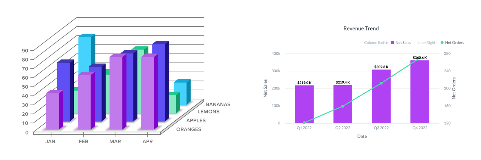
Do not overload your audience with all the information with unnecessary data points. Plan your visualizations and then present them to the relevant audience.
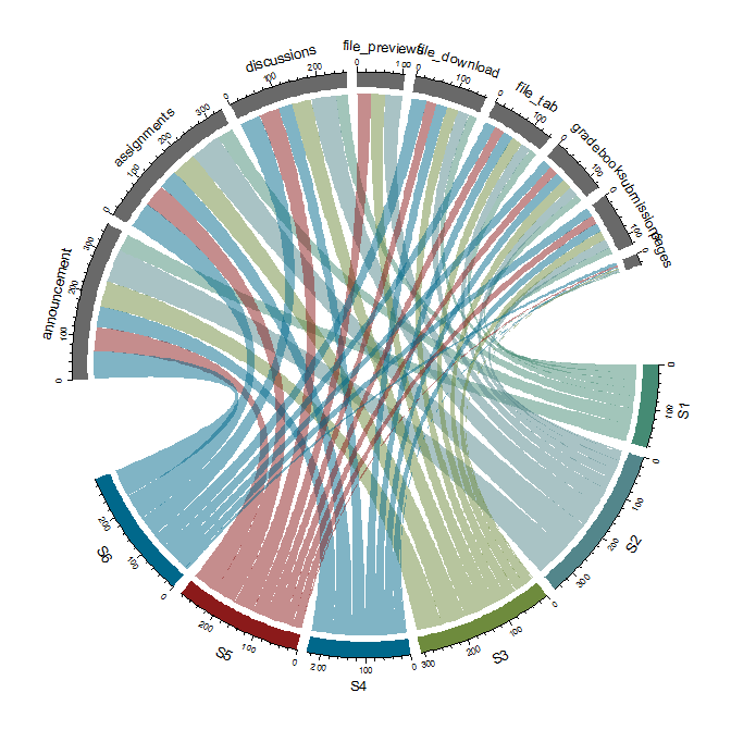
6. Keeping it Simple
Look at the chart below. It is confusing and not easy to comprehend. The chart communicates the data but overwhelms readers, who cannot make quick decisions or gain insights. Hence, keep your visualizations simple.
If you feel every data point is crucial, ask the following questions to make it simple, unique, and presentable.
- What are the most important data points?
- How can you summarize the data to make it less complex?
- What unnecessary details can you exclude?
- What visual aids can you use to make it more understandable?
- How can you break big datasets?
- Can you group similar datasets?
Less is always more, so understand the needs of your end users. If your charts are complex, educate your audience about the available data points.
7. Making it Interactive
Today’s users expect interactions. They do not just want pretty visuals; they expect to engage with your data. Interactive visualizations are important, whether your visualization is about tracking fitness progress or providing a weather forecast.
So, how do you make interactive visualizations? Below are a few points to help you make the most appropriate visualization.
- Select the right tools and techniques.
- Look for software that offers a range of features.
- Structure, clean and prepare your data
- Select the type of visualization that fits your design and data needs
- Add interactive elements, such as filters and tooltips
Interactive visualization suits the user’s needs, boosts engagement and overall productivity, and helps simplify complex data.
8. Telling a Story
What is the unique value of using data to tell a story? Data storytelling transcends mere numbers when it comes to engaging your audience. It’s the key to unveiling the underlying narrative that informs and persuades your audience.
The benefits of telling a story with your data are many, some of them include:
- Helps make informed decisions based on your data
- Gives access to relevant data at the right time
- You can make data-driven decisions.
- Prevents confusion
So, be clear about who your data story is for. The story should align with the frequency of your decision-making. Moreover, the data must align the themes with the colors, fonts and logo to meet your business’s guidelines.
9. Customizing for Personalized Experience
Imagine a store with products tailored only to your needs and preferences. Wouldn’t you connect more with the store? Similarly, the audience connects more with personalized visuals. So make your visualizations that interest your audience and their requirements.
To understand your audience, ask yourself the following questions:
- Who are the users, and what are their preferences?
- What color palettes and themes resonated with your audience?
- What interests your users, and how can you incorporate that into your designs?
- What interactive features will benefit your audience?
- How can you provide easy access to top data?
Therefore, make the most creative and appealing visuals customized for a personalized experience.
10. Ensuring Accuracy and Integrity
Maintaining data accuracy and integrity is vital in data visualization. So double-check your source, clean your data, and verify your visuals for accurate reports.
To accurately represent your data, here are some questions that can help you.
- How will you verify the accuracy of your data source?
- What steps will you take to clean and pre-process your data?
- How will you handle missing or incomplete data?
- What methods will you use to validate data accuracy?
- What quality measures will you take to detect errors and correct them?
Addressing these questions, you can enhance the accuracy and integrity of your data visualizations.
Conclusion
Want to create impactful visualizations and stay ahead of the curve? Then, focus on visualizations that aren’t just fancy but also give meaning to your data with the designs.
Not sure where to start? Let Augmented Systems’s data visualization specialists help you, similar to the countless businesses we helped transform. To drive growth and success, contact us today.