- Data Visualization Components: Table of Contents
- What does Data Visualization Mean, and Why is it Important for Your Business?
- Why Does Data Visualization Matter?
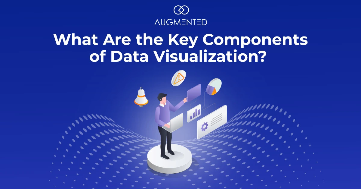
- What are the Key Data Visualization Components?
- 1. Purpose
- 2. Story
- 3. Accurate and Relevant Data
- 4. Smart Design Choices
- How Can You Make Data Visualization Effective?
- What are the Best Practices for Data Visualization? How to Get it Right?
- Your Next Steps in Transforming Data Visualization with Augmented Systems
- Data Visualization Components: FAQs
- 1. How do I choose the right data migration tool for my business?
- 2. What are the biggest challenges in implementing data visualization?
- 3. How does Augmented help enhance traditional data visualization?
- 4. What industries benefit the most from data visualization?
Every business today is trying to leverage the potential of data-driven decision-making.
And it’s easy to see why…data can fuel:
- Tracking customer behavior and preferences
- Identifying business opportunities and risks
- Measuring sales performance and revenue trends
- Optimizing operations and efficiencies
- Enhancing marketing campaigns with real-time insights
And so much more!
But here’s the catch: Raw data isn’t alone enough. Without the right tools to visualize it, all your valuable data and its information remain hidden in spreadsheets and reports.
That’s where data visualization components come in!
The right charts, graphs, and interactive dashboards help you transform your complex data into clear and compelling stories. (Helping you and your team to make smarter decisions, faster.)
But with so many visualization options available, how do you know which components are important for crafting your powerful data story?
To help you out, I’ve rounded up the best data visualization components that will bring insights to your data.
(Remember, there is a visualization solution for every data need!)
Let’s jump in!
Data Visualization Components: Table of Contents
- What does Data Visualization Mean, and Why is it Important for Your Business?
- What are the Key Data Visualization Components?
- How Can You Make Data Visualization Effective?
- Your Next Steps in Transforming Data Visualization with Augmented Systems
- Data Visualization Components: FAQs
What does Data Visualization Mean, and Why is it Important for Your Business?
Imagine running a manufacturing business. You want to understand your sales trends over the last year.
Would you rather:
1. Read a report with 10,000 rows of sales data broken down into regions, products, and time.
Or,
2. See a line graph showing how sales have increased or decreased over the last few months.
If you’re anything like me, you might go with option 2!
That’s exactly what data visualization does. It transforms complex data into beautiful pictorial representations, such as charts, graphs, heatmaps, and infographics, which make information easy to understand.
Why Does Data Visualization Matter?
In our experience, there are four major reasons why data visualization is critical to enterprises:
- We’re Wired for Visuals: Our brains process images 60,000 times faster than text.
- Faster Decision-Making: Charts and graphs help you spot trends and patterns easily and help you make better decisions.
- Better Communication: Data visualization makes it easier for you to share insights with your teams, clients, and stakeholders.
- More Engaging and Impactful: Visuals grab attention, making them ideal for business reports, marketing presentations, and research findings.
Regardless of the field you’re working in, data visualization makes information easy to grasp and understand. It helps businesses track sales, healthcare workers monitor patient trends, and governments map population changes.
So whether you are analyzing budgets, measuring marketing success or spotting patterns, good visuals are a must!
But the real question is, how can you visualize data effectively?
To be honest, it’s not about picking up a random chart or graph. It’s about choosing the right way to present your data so that it’s clear, useful, and easy to act on.
So, let’s break it down and see how you can do it the right way!
What are the Key Data Visualization Components?
Think about the last great movie you watched. What components made it great?
It had a purpose, a great story, strong characters, and an engaging design, i.e., visuals!
Good data visualization follows the same format. It needs a clear goal, a compelling narrative, accurate data, and a smart design.
When you miss any of these key data visualization components, your visualization falls flat! But when done right, your data will speak for itself.
So, let’s quickly examine four key components that distinguish a forgettable chart from one that makes people stop and pay attention.
1. Purpose
Before you start creating your visualizations, ask yourself: What message do I want to convey? Or What insights do I need from this data?
In my experience, every effective data visualization starts with a clear goal. Without a clear purpose, your data risks becoming just another set of numbers that people glance at and forget.
Think about what you’re trying to accomplish:
What’s the Goal of Your Data Visualization?
- Are you highlighting a trend?
- Are you comparing numbers?
- Are you telling a success story?
A clear purpose makes sure that your visualizations drive real business results rather than just displaying numbers.
2. Story
Now that you have a purpose for your visualization, the next question you need to ask yourself is: What story does your data want to tell?
Think about it this way. Your company wants to understand if happy customers really bring in more money.
You’ve got two spreadsheets with separate reports: One with customer ratings and another with sales numbers.
When you look at them separately, they won’t reveal much. But when you put both the reports, say, in a scatter plot, you can see a clear pattern: higher customer satisfaction leads to higher sales and more revenue.
That’s the power of storytelling in data visualization.
What Should a Great Data Story Show?
- Highlight the key insights: What’s the important takeaway?
- Show relationships and patterns: How do different data points connect?
- Lead to a clear conclusion: What action should people take?
For example, instead of just listing monthly sales figures, show how sales have grown over time or what caused the increase in sales. That way, your data won’t be just information, but it would actually make sense.
3. Accurate and Relevant Data
Let’s say you are trying to compare online vs in-store sales.
You pull the data, create a beautiful chart, and present it to your team.
But there’s a problem…someone accidentally included last year’s numbers with this year’s numbers.
Now, your chart shows a fake sale surge that doesn’t actually exist. Or worse, it makes it look like sales are dropping when they’re not.
That’s why accurate and relevant data is everything in data visualization. No matter how eye-catching your graphs look, if your data isn’t correct, the insights won’t matter.
How to Keep Your Data Clean and Meaningful?
- Avoid outdated and incomplete data
- Eliminate unnecessary information
- Ensure consistency across sources
Pro Tip: Always double-check your data before visualizing it. Even a small mistake, like swapping rows in a spreadsheet or using the wrong data range, can completely change how people interpret your information.
4. Smart Design Choices
How would you feel looking at a dashboard packed with tiny text, clashing colors, and overlapping graphs?
In my experience, readers often get frustrated when they come across visuals that are too vibrant and distracting.
For the same reasons, designs matter in data visualization. Even the most accurate data and visualizations can lose their impact if it’s cluttered, confusing, or hard to read.
How to Make Your Visualizations Clear and Effective?
- Use contrasting colors
- Highlight key trends with distinctive colors
- Keep labels clear
- Use bold text wherever needed
- Do not overwhelm the audience with extra elements
- Use simple fonts, clean layouts and enough spacing
Your goal should be a clear and easy-to-read visualization that delivers insights instantly, such that your audience gets the message without any guesswork.
How Can You Make Data Visualization Effective?
Still not sure how to improve your data visualization? No problem. I’ve some data visualization best practices that can help you make the most of your data.
As we explored the different essential data visualization components, one thing became clear: even with the right elements in place, a visualization can still fail to make an impact if not executed effectively.
It should not be cluttered or confusing and should definitely NOT guide your audience from the key takeaways.
Thus, to truly make an impact, you need to fine-tune every detail.
What are the Best Practices for Data Visualization? How to Get it Right?
- Use Clear Headings and Labels: Your audience should instantly understand what they are looking at. A simple, well-placed title can make all the difference.
- Simplify Complex Data: Less is more. So, do not overload your visuals with too much information.
- Highlight Key Insights: Draw your audience’s attention to the most important trends with bold colors, callouts, or annotations. If a number stands out, make sure it’s impossible to miss!
- Select the Right Chart Type: Pick visuals that match your data’s purpose:
a. Heatmaps for patterns and analysis
b. Pie charts for proportions
c. Bar charts of comparison
d. Line charts for trends over time
- Make it Visually Appealing: Use contrasting colors, icons, and spacing to create a clean and professional look.
- Utilize Interactive Visualizations: Static charts provide just a snapshot. But tools like Tableau, Power BI, and Google Data Studio let their users explore data dynamically, leading to deeper insights.
When data is right, data visualization won’t just display your numbers but give it a whole different meaning. A well-designed visual tells a story, highlights trends, and leads to better decisions.
So, before you hit “Publish” on your next report or dashboard, ask yourself: is my data telling the right story in the clearest possible way?
Your Next Steps in Transforming Data Visualization with Augmented Systems
Now that you know what makes a great data visualization, it’s time to make it happen! But what if you could do it faster, with less effort, and get better results?
That’s where our data visualization consultants and experts at Augmented Systems can help you!
We specialize in data visualization, analytics and BI solutions, helping you turn your complex data into real decision-making visuals. At Augmented Systems, our data visualization philosophy is driven by four elements:
Purpose. Story. Accuracy. And Clarity.
So, if you need a reliable data visualization consultant, why not connect with us for a commitment-free consultation? Our experts will work with you to convert your vision into actionable visualizations for vibrant results!
Data Visualization Components: FAQs
1. How do I choose the right data migration tool for my business?
Choosing the right data visualization tool depends on your data needs, technical experience, and business goals. We would recommend that you consider factors such as ease of use, integration with existing systems and scalability options before selecting a tool.
2. What are the biggest challenges in implementing data visualization?
Some common challenges in implementing data visualization include data quality issues, integration complexities, and the learning curve for new tools.
3. How does Augmented help enhance traditional data visualization?
We use AI and machine learning to automate data analysis, detect patterns, and provide predictive insights. Automation helps reduce manual efforts, minimizes human errors, and allows you to gain deeper insights faster. Plus, if you are a non-technical user, you can also interact more intuitively with your data.
4. What industries benefit the most from data visualization?
Almost every industry can benefit from data visualization, including finance, healthcare, retail, manufacturing and marketing